Ambient Pressure Level Design

Due to the art of the game now having little for me to do, I was tasked with helping our level designer by coming up with a few level designs this week. As such, I spent a lot of the week brainstorming, and having little to show for my work.

However, as today rolled in, I had enough to do a few level suggestions.

Map Idea A Map Idea B Map Idea C Map Idea D

The main issue with designing levels for this game is the fact that the levels have to be simple, but they can’t be too simple as they would not pose a challange if it was so. Being my first try at designing levels for a game like this, I did some playing around.

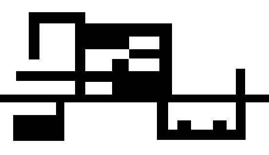
First example was my first design, and was based around the same straight line, which I then made extentions of. Might be possible to remove some extentions and add a couple more entries and exits to rooms, the dead ends would potentially be very bad if chased by one of the fish.

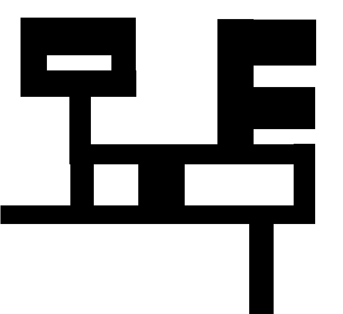
The second example is a lot more simplistic, perhaps too simplistic in fact. It has two rooms and a ”round” section in the middle, It is rather genetic, and at the very least would not be too difficult to navigate even with the limited vision of the game.

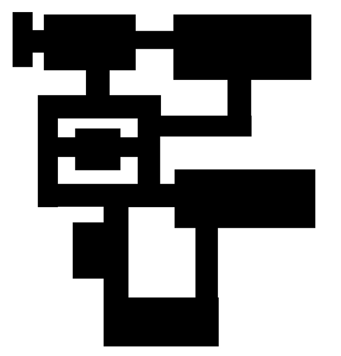
Example three is, perhaps, the level I am feeling the most attatchment to, with it’s many paths that lead the same way, big open areas and hallways. Less linear than the others, but perhaps a bit too dificult to navigate in darkness. If there were time, it could be tested too see if it is too difficult to navigate. The paths leading to the same rooms and between rooms accessable though another room could either make it easier to navigate, or more difficult and leave the player swimming in circles. While I quite like this level, I am not certain it will function in the game.

Example four also has the issue with a dead end. Perhaps adding further paths to it, either up or down, could help this level, as it is otherwise rather simple. Perhaps another room should be added to it, to help against it’s simplicity, or perhaps it would do fine as a starting level with the dead end connected to somewhere.

All in all, what took time in this assignment was to find the ideas, and a good idea would be to leave levels be a few hours to later look upon them with a fresh eye to spot the flaws and see if you can remedy them. Something to think about.

Ambient Pressure Buttons

Buttons for Preview Game Screen

I spent this week making the buttons for all of the menus and maintaining the Scrum Backlog. As I cannot find 400 words to write about the later, I simply will have to try with the former.

The main issue with the buttons has been to find a suitable font, as well as the changes in what exactly the buttons say. After a couple of times rewriting the buttons – changing font, changing actual words – the buttons have finally settled down at a final look.

There were two requirements we placed upon the font we should use: 1, It needs to be readable on the screen, and 2, it needs to be free for comercial use. Mentally I added a third condition, that it would suit the game. For the additional third condition, I only looked for suitable fonts on dafont.coms categories Eroded, Distorted, and Destroy. Among the fonts I found that I thought suited the games ambiance, only one was free for comercial use. As such it was chosen for the buttons.

That I later noticed that it was the font originally used by the group who built the concept of Ambient Pressure was an unexpected but pleasant discovery.

The pick of the font was originally because it reminded me of the first groups font, and the fact it seems to be dissolving – something certain things does when submerged in water, and thus I thought it would suit the underwater ambiance.

R ButtonR Button Light

As I was making the buttons, I was also tasked with making sure they can change colour once moused over, which, while done simply by changing text colour, had to be visible on all of the possible places for them to be placed on the game screens. Going from black to a very bright blue was an easy pick – partly for it to be obvious, but also partly to keep to water-y colours.

Due to the choice in colours having to be visible, I decided the best placement for them to be on the lower part of the background, with only the two first buttons on the menu above the middle line. This makes them appear far down, so they don’t take over the screen, and gives a lot of empty space on the screen. The buttons were placed at the right side of the screen due to the suggestion of the level designer.

The buttons remains fairly simple, text-only buttons to melt together with the background a bit – though not too much – and blend in with the otherwise simplistic style of it.

Ambient Pressure Screens Background

BakgrundI spent a 40 minutes an evening looking up ways to create an underwater picture, before settling on a simple method only utilizing six PhotoShop tools.

A blue and black gradient is the biggest part of the background.

I then used white and black to render clouds – after that, I used the filter gallery to turn a plastic wrap filter (settings being Highlight Stregth 12, Detail 9, Smoothness 7) on, followed by adding linear dodge to make it blend in with the background. Free Transform was then used to make it form the water surface. Using a mask to remove the edges, making it more natrual and help it blending in, I then dublicated the layer and used Free Transform to turn the second layer upside down. I proceeded with moving it to the bottom of the background. Changing linear dodge to colour dodge to make it melt into the much darker background, and then I lowered the opacity to about 70%.

After I finished with that I could fix the light, to really get the underwater look and hiding the gradiant, rendering black and white clouds once again, this time without turning on the plastic wrap filter – instead using a Radial Blur (settings being Zoom, Amount 100, best quality), and then adding linear dodge for it to not literally cover the rest of my work. After that it was just the matter of stretching it so it covers the entire scene and using a mask I to make use of a black and white gradiant to stop it from being overpowering.

It took three to four tries to get perfect, instead of small flaws everywhere.

This was to create a background that could give the player a sense of being underwater. It has a very simplistic style, looks pretty good, and is relatively simple to create with decent knowledge of PhotoShop tools.

Worth noting is that using black and blue is not an excellent idea when rendering clouds, the effect doesn’t seem to turn out as good when doing that. You can’t render clouds at a too small surface either, it is better to go big than to go small. And the picture does not look complete without the shadow at the bottom. Don’t forget to use the mask to not leave the light a bit too overpowering, and it really doesn’t work without the light either as it will be obvious the background is just a gradiant.